Our research process when working with colleges
All new projects we undertake start with a series of sessions where we get to know your institution.
We need to understand what your goals and objectives are for the new website. We engage with your staff, students and their parents to hear first hand their own personal experiences. We will go to schools and talk to your prospective students. And we spend time reviewing your existing website and digital strategy to see where we can add value.
This initial period of consultation and review is integral to our process and informs all future stages of work.
Stakeholder interviews
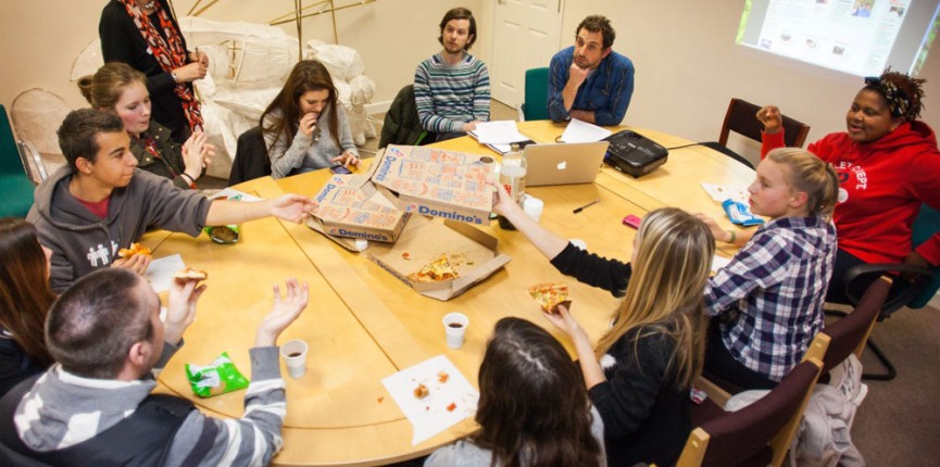
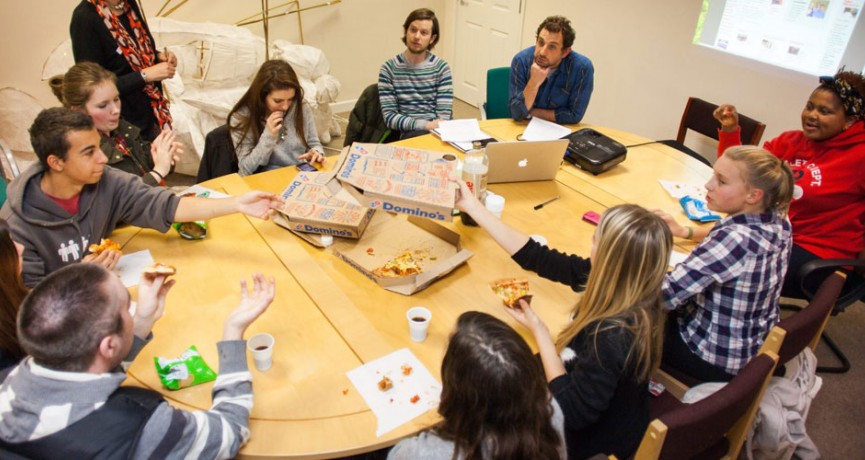
Our stakeholder interviews are informal group sessions with no more than 6 people per session. Keeping the groups small is important, especially with a younger audience, to ensure everyone in the room is comfortable opening up and participating in a focused discussion. We use visual material with our younger groups to help stimulate thoughts and ideas, however the adult sessions are purely discussion-based.
Testing and analysis
Our one-to-one usability tests are carried out with range of audience types — typically staff, current students and prospective students. We get people to verbalise their thoughts as they try to complete simple tasks on the current institution's website as well as competitor websites. This gives us a great insight into how people respond to certain content types, terminology and navigational structures.
Concept development
All outcomes of the user research informs subsequent stages of concept development. Away from a computer screen, we develop paper-based prototypes that define page layouts, establish user journeys and help us understand the most appropriate content types to be used. When presented back to the steering group we encourage interaction, where rapid changes ensure the client is very much part of the creative process.
Things we've learned
1. Better focus groups with under 18s
Group discussions can be quite daunting for younger participants. Having the confidence to form an opinion and verbalise this to a group in front of their peers does not come easily to many. We have evolved our sessions with a younger audience so we now spend time reviewing the styling of websites and looking at the different approaches institutions take to their video content. The best way to make people feel relaxed is for the group to share a few laughs — and watching a few good (and bad!) videos does exactly that.
2. One-to-one usability testing
In our experience, the usability tests that return the most useful results and insightful observations are those where the participant feels relaxed and can chat freely. Our one-to-one usability tests aren't carried out in a formal 'testing suite' environment, but simply on a single laptop in the corner of a quiet room. The laptop records what happens on the screen whilst recording the participant via the webcam (with their consent, of course) — so we capture everything that's required without it feeling like a test. We build a discussion with the participant throughout and whilst they're still completing preset tasks, the session feels more like an informal chat and gives us a great insight into their browsing behaviour.
3. Forming a small steering group
It's imperative that key stakeholders are involved in the development of your new website. However having to consult a large range of people every time a decision needs to be made is neither practical or useful. We suggest forming a small steering group of 3 - 5 people, made up of a range of staff who are passionate about the project. This allows decisions to be made quickly and avoids a 'design by committee' approach that can result in a diluted message.
4. 16 year olds aren't always web savvy
There is a preconception that young people are the most digitally aware demographic. That they are at ease with technology and use their various devices to access the internet 24/7. In our experience much of this is true, however what is important to note from our own observations is that the activities they are involved in are very specific. Rather than being proficient in their use of the wider internet, they use specific apps like YouTube, Facebook, Instagram and Snapchat. Whilst constantly being online and in contact with their friends, we have observed young people to be quite timid and unconfident web users who need as much hand-holding as possible when accessing information-based websites.
5. The student voice
Students are the life-blood of your institution and your website must reflect this. In almost every focus groups we run, we hear students say that they respond so much better to content created by other students. To watch a video where a student talks about their own personal experiences immediately engages and carries an authenticity which cannot be matched by an institutional voice. Your website should be full of targeted, student experiences that support your content and talk directly to your prospective students.
6. Simplify your navigation
It's important that your website structure reflects the needs of your different audience members and allows easy access to important content. But displaying lots of navigation options on the screen in order to cover all bases has the adverse effect. People don't know where to click when presented with too many choices so simplifying your navigation down to 3 - 6 main sections makes scanning much easier. It also means you can focus people's attention on the most important sections whilst creating less chance for uncertainty. With ten options on the screen, people would need time to consider the options and decide where something may reside. But with only four options, that decision becomes much easier and people quickly get to where they're going with less stress.
Published 16th April 2016